Song Bouquet
An online custom song gift company
An online custom song gift company
Logo and website design for Song Bouquet.
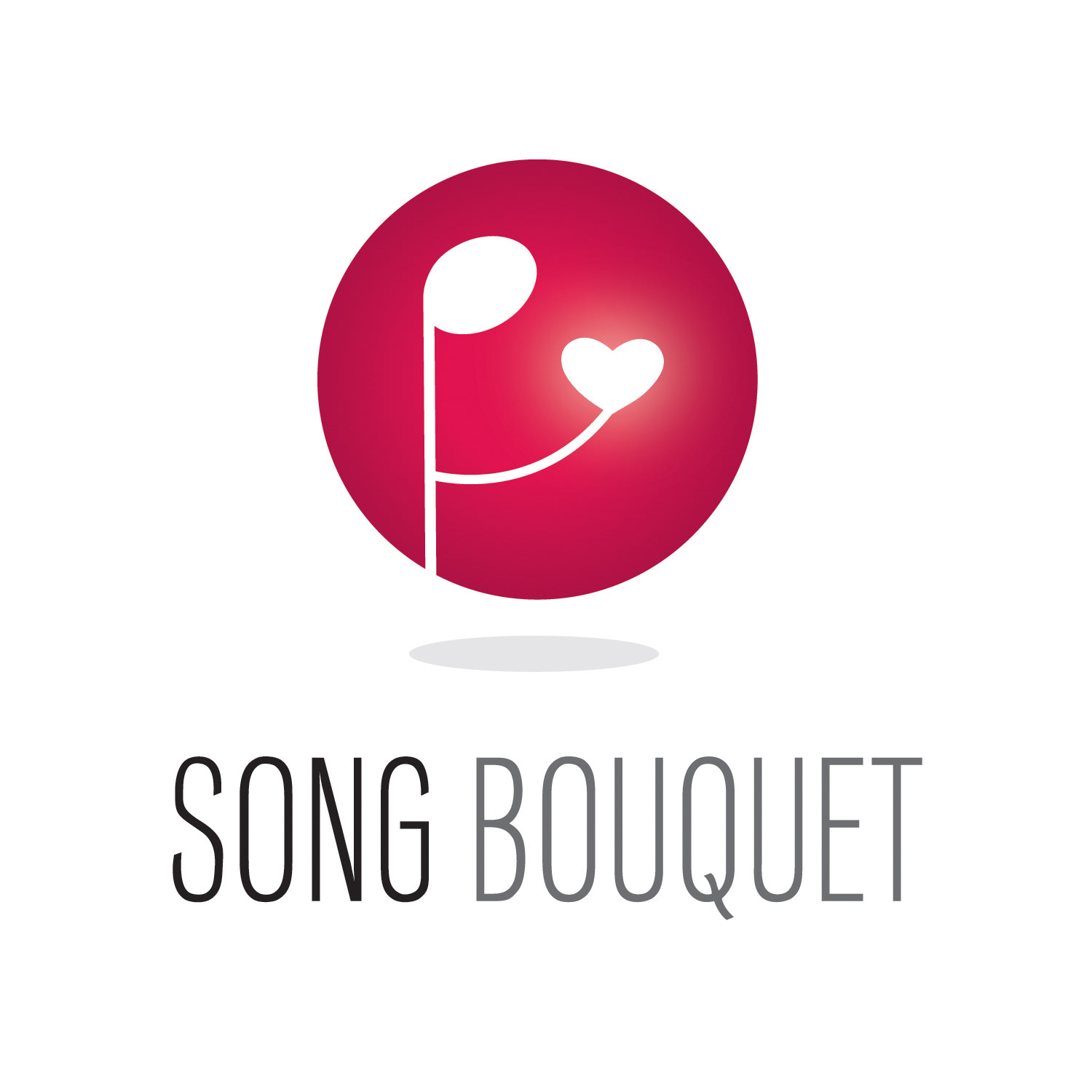
This logo captures the essence of Song Bouquet, and its unique gift giving experience. It brings together the essential components of Song Bouquet: music, people, love, and the spirit of giving in a digital world.
The logo shows a music note that represents a person. The person holds out a heart as a gift. The heart glows in the hand of the music note/person, reinforcing the idea that Song Bouquet is a unique and special gift.
The overall style of the logo is clean and modern with a web feel. A gradient of red/pink is used to create depth. The shadow below creates an environment and floats the circle logo in space—giving it a magical quality.
Color is a powerful visual asset in the Song Bouquet logo. Each color elicits different feelings that, when combined, capture the essence of the brand. The red/pink color represents love—the driving force behind the Song Bouquet customer. The color is seductive, passionate, optimistic and theatrical, all strong characteristics of Song Bouquet and its product. Gray is durable and timeless, much like the gift Song Bouquet creates for its customers. Gray also represents dependability and quality, two key traits of Song Bouquet’s product and brand. Gray compliments the excitement of red.